10 Landing Page Mistakes that's Killing Your Conversions

A visitor clicks your ad, lands on your page, and leaves in under five seconds. Nothing broke. No error, no slow load, no bug. The page just failed to answer the one question every visitor asks first:

what is this, and why should I care right now?

Most landing page mistakes aren’t one dramatic flaw. They’re a stack of small structural blockages, each one shaving off a percentage of visitors until the number left at the bottom of the funnel barely moves.

The Most Common Landing Page Mistakes (and How to Fix Them)

Here are the ten most common ones, and the formatting fix for each. If you’d rather have someone else build the fix than diagnose it yourself, this is exactly what my landing page design work covers.

1. The Headline Describes a Feature, Not a Result

AI-Powered Analytics Dashboard” tells a visitor what you built. It doesn’t tell them what changes in their life if they use it. A headline needs to answer “what’s in this for me” inside the first five seconds, before a visitor decides whether to keep reading.

Fix: Rewrite the headline around the outcome, not the mechanism. “See Which Campaigns Are Losing You Money in Under 5 Minutes” beats “Advanced Marketing Analytics Platform” because it names the result, not the tool. CXL’s breakdown of conversion-focused copywriting covers this exact principle in more depth.

One of the most common landing page mistakes: a headline describing a feature instead of a result
landing-page-mistakes-message-mismatch

2. Message Mismatch With the Traffic Source

A visitor clicks an ad promising “50% off your first order” and lands on a generic homepage with no mention of the discount. The gap between what was promised and what showed up reads as a bait-and-switch, even when it isn’t one.

Fix: Match the headline and hero copy to the exact language of the ad, email, or post that sent the click. If three different campaigns drive traffic with three different promises, build three landing pages, not one page trying to cover all three.

3. Multiple Competing Calls to Action

A page with a “Buy Now” button, a “Learn More” link, a newsletter signup, and full site navigation gives a visitor four decisions instead of one. Every extra choice is a chance to leave without acting on any of them.

Fix: Pick a single primary conversion goal for the page and remove or visually mute everything competing with it. Strip the main navigation on dedicated landing pages. One button, repeated at logical points down the page, does more than five different options scattered across it.

Landing page mistakes caused by multiple competing calls to action confusing visitors
Vague button copy is one of the small landing page mistakes that quietly hurts conversions

4. Weak Button Copy

“Submit” and “Learn More” describe an action with no value attached. A visitor has to do the work of imagining what happens next.

Fix: Name the outcome inside the button. “Start My Free Trial,” “Get My Quote,” “See Pricing” all tell the visitor exactly what they get for the click. Test the button copy the same way you’d test a headline.

5. No Visual Hierarchy

When every element on the page carries equal visual weight, headline, body text, testimonial, footer link, the eye has nowhere obvious to land. A visitor scanning for three seconds sees noise instead of a message.

Fix: Use size, weight, and whitespace to create one clear path: headline first, supporting subhead second, CTA visually distinct from everything around it. If you can’t tell someone where their eye should go first without looking at the code, neither can your visitor.

Landing page mistakes in visual hierarchy, cluttered layout versus clear focal point
Landing page mistakes around generic or missing trust signals near the call to action

6. Missing or Generic Trust Signals

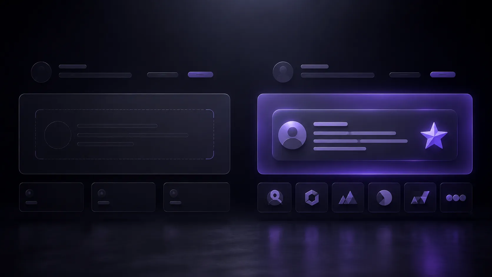
“Trusted by thousands of customers” with no names, no numbers, and no faces reads as filler. Vague social proof does less work than no social proof, because it signals the page is padding for credibility it doesn’t actually have.

Fix: Replace vague claims with specific ones: real customer names, recognizable logos, a testimonial with a name and role attached, or a stat like “Used by 1,240 coaches to fill their calendars.” Place proof near the CTA, not buried in a footer section nobody scrolls to.

Check my portfolio for what specific, real proof looks like in practice.

7. Unaddressed Objections

Every visitor arrives with a silent question the page never answers: “Will this actually work for someone like me?” “What happens if I’m not happy?” “Is this going to be a hassle to set up?”

Fix: Add a short FAQ section or objection-handling block addressing the three most common hesitations your sales conversations already surface. A guarantee, a “cancel anytime” line, or a “takes 5 minutes to set up” note removes friction without adding length to the page.

Landing page mistakes that leave visitor objections unanswered before the CTA
Long forms are a common landing page mistake that adds friction before conversion

8. Too Many Form Fields

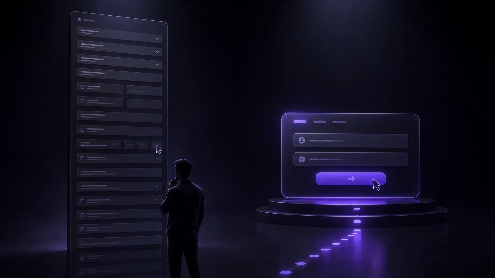
A form asking for phone number, company size, job title, and budget before someone even knows if this solves their problem adds friction that kills conversions before the value’s been proven. Every extra field is one more reason to abandon.

Fix: Ask only for what’s needed to make first contact, usually just name and email. Save the qualifying questions for the call or a follow-up. If you genuinely need more information upfront, split it into a multi-step form so the first ask feels small.

9. Slow Load Times and Unoptimized Mobile Layout​

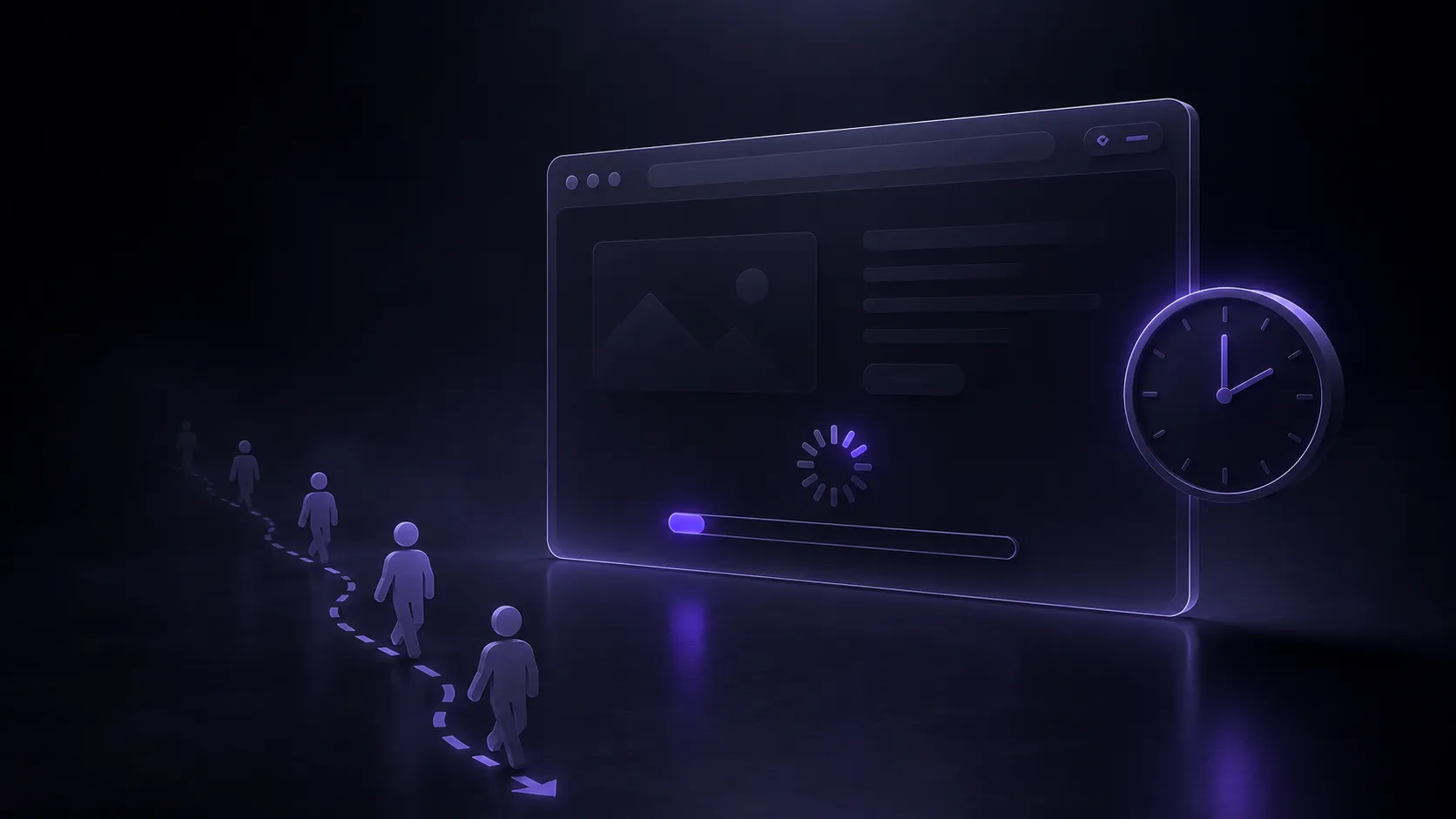
A page that takes four seconds to load has already lost a large share of visitors before they see a single word of copy. Portent’s analysis of over 27,000 landing pages found that a page loading in 1 second converts at nearly 2.5x the rate of one loading in 5 seconds, and most landing page traffic now arrives on a phone, not a desktop.

Fix: Compress hero images, remove unnecessary scripts, and test the actual mobile layout on a real phone, not just a resized browser window. A CTA button that requires a visitor to pinch-zoom on mobile is a conversion killer hiding in plain sight.

Slow load speed is a landing page mistake that costs conversions before content even loads
A landing page mistake many pages make: no clear next step after the CTA is clicked

10. No Clear Next Step After the CTA

A visitor fills out the form, hits submit, and lands on a blank confirmation page or gets redirected to the homepage. That silence creates doubt: did it actually work? What happens now? Uncertainty right after conversion is where trust quietly erodes, at the exact moment you have their fullest attention.

Fix: Build a proper thank-you page that confirms the action worked, sets expectations for what happens next (“check your email for a calendar link” or “I’ll call you within 24 hours”), and offers one small next step, like a case study or FAQ.

The Pattern Behind These Landing Page Mistakes

Every mistake above traces back to the same root cause: making the visitor do work the page should be doing for them. Guessing what a headline means, hunting for the right button, wondering if the page is legitimate, not knowing what happens after they submit, all of it is friction the page created and the page can remove.

Fixing landing page mistakes isn’t about adding more convincing. It’s about removing decisions. The version that converts best is usually the version that asks the least of the visitor.

Want a second pair of eyes on your own page? Get in touch and I’ll walk through what’s actually costing you conversions

Scroll to Top